
Colorful Plates, Mindful Bites
Today we explore Plating with Purpose: Using Color to Boost Appetite and Portion Control, turning everyday meals into thoughtful, visually guided experiences. Discover how strategic hues, contrasts, and dish shapes can gently influence hunger, satisfaction, and balance. Expect practical tips grounded in behavioral science, engaging anecdotes from real kitchens, and simple experiments you can try at home tonight. Share your results, refine your setup, and build delicious habits that respect your goals without sacrificing joy, flavor, or creativity.
The Science Behind Appetite and Color
Color is more than decoration; it shapes perception, expectation, and intake. Warm hues can subtly awaken appetite, while cooler palettes calm cravings and slow pacing. Contrast between food and plate influences serving size, and visual illusions affect fullness cues long before you take a bite. By understanding these dynamics, you can design meals that encourage balance, reduce mindless overeating, and still feel generous. Small changes—like swapping plate colors or adjusting rim width—create measurable differences without relying on willpower alone.
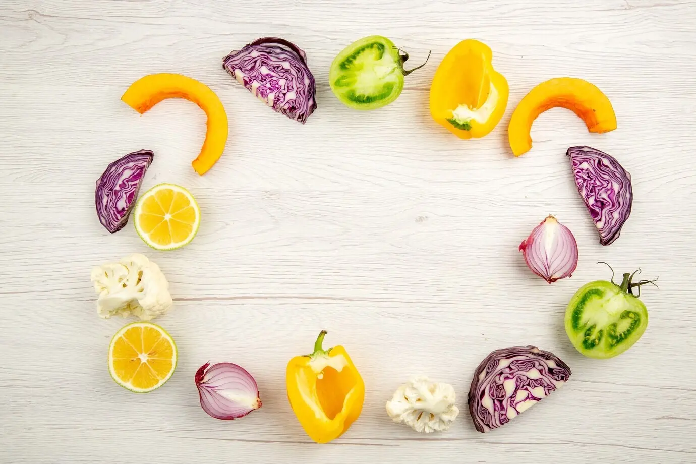
Designing Plates That Guide Portions
Half-Plate Color Map
Divide the plate visually with color cues: a leafy or neutral half inviting vegetables, a calm quadrant for proteins, and a warm accent for grains or starches. These cues act like landmarks, helping you assemble balance without measuring cups. If you lack multi-toned plates, use placemat patterns or napkin folds to suggest boundaries. Over time, you’ll eyeball portions with surprising accuracy. The best part: the map supports flexibility, accommodating stews, salads, or family-style spreads without rigid rules or stress.
Shapes, Bowls, and Transparency
Deep bowls hide portions and encourage refills, while wide, shallow bowls display volume honestly. Opaque dishes prevent visual underestimation; transparent glass can distort depth cues depending on lighting. Curved rims make edges fuzzy; straight-sided plates sharpen boundaries. Mix formats intentionally: a shallow plate for pasta, a small ramekin for nuts, and a transparent tumbler for water. Align colors accordingly—high-contrast for calorie-dense foods, low-contrast for leafy abundance. These design choices lower cognitive load and reduce accidental overpours.
A Bistro’s Switch That Saved Calories
A neighborhood bistro swapped oversized white plates for slightly smaller slate-blue ones and introduced a subtle ring to frame entrées. Bread service moved to warmer-toned baskets to limit grazing by making pieces feel more noticeable. Guests praised the presentation, lingered longer, and reported feeling satisfied without heavy fullness. Kitchen waste dropped, and dessert orders became more deliberate, not automatic. The change required no menu overhaul, only visual coaching that aligned portions with pleasure, value, and a gentle sense of sufficiency.
Tailoring Colors for Different Diners
Different eaters benefit from different visual strategies. Children engage with bright contrasts and playful patterns that make vegetables look adventurous. Athletes cycling through training phases need cues that guide fueling without triggering restriction. Seniors, especially those with cognitive changes, may require stronger contrast to recognize food clearly and eat comfortably. By adjusting plate color, background textiles, and lighting, you invite the right appetite at the right moment. Personalization keeps meals joyful, supportive, and respectful of evolving needs.
Playful, High-Contrast Plates for Kids
Children often respond to curiosity and discovery. Use bold contrasts—emerald broccoli on sunny plates, beet hummus beside cool cucumber—to create playful surprises that invite tasting. Small, divided plates with color-coded sections help them assemble balanced bites independently. Offer dips in cheerful ramekins, turning vegetables into mix-and-match experiments. Celebrate exploration, not perfection, and narrate color adventures: “Let’s build a rainbow bite.” Over time, attention shifts from ‘eat your veggies’ to “try the purple crunch,” reducing battles and building positive memories.

High-Performance Fueling Without Overpouring
For athletes, plating color can cue periodization. During heavy training, mellow contrasts on moderate plates encourage adequate carbohydrates without looking daunting. On recovery or cutting days, sharper contrast and smaller surfaces support precision without feeling punitive. Highlight proteins with calm, cool backgrounds to emphasize quality, and spotlight produce with vibrant accents to sustain volume and micronutrients. Pair with transparent hydration cues—clear bottles within reach—to normalize fluid intake. The result is a flexible visual language that supports goals compassionately.
Dignity and Appetite in Senior Care
Stronger contrast between food and plate can help older adults see meals clearly, especially when vision or cognition changes. Studies have observed improved intake when highly visible dishes are used in dementia care, with warm, distinct colors making portions recognizable. Keep plate size moderate to avoid overwhelming the eye, and simplify place settings to reduce confusion. Gentle, even lighting further clarifies edges. Prioritize dignity by offering attractive, easy-to-navigate presentations that encourage appetite, independence, and the pleasure of familiar flavors.
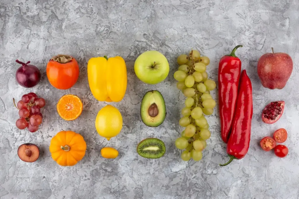
Seasonal Palettes and Cultural Cues
Color carries meaning shaped by season, memory, and heritage. Lean into spring greens and citrus brightness when produce is crisp and tender. Embrace autumnal ambers and deep burgundies to frame slow-cooked comfort. Respect cultural symbolism—some colors signal celebration, others solemnity—and present dishes accordingly. Seasonal alignment makes healthy portions feel intuitive, not prescribed. By pairing ingredients and plate tones thoughtfully, you create a conversation between landscape, tradition, and appetite that encourages balance while honoring the stories your table tells.
Your Home Plating Toolkit
Build a simple kit that makes purposeful choices effortless. Mix one neutral workhorse plate, one darker contrast option, and a warmer accent piece for comfort foods. Add small bowls for nuts or sauces, and a few linens that shift mood seasonally. Keep lighting soft but bright enough to clarify edges. This toolkit removes guesswork, aligning appetite with intention. With a handful of versatile pieces, you can compose balanced meals quickly, reduce waste, and retain the freedom to improvise on busy nights.
Measure, Reflect, and Share
Small Experiments, Clear Evidence
Run two dinners with identical recipes: one on high-contrast plates, one on low. Photograph portions, note pace, and record fullness ten minutes after finishing. You’ll quickly see which colors help you stop comfortably. Repeat with different dishes and lighting to refine insights. No strict tracking required—just honest observation. Over weeks, small findings accumulate into wisdom, showing where your environment supports goals and where tiny adjustments, like swapping a bowl, unlock easier balance with zero deprivation.
A Mindful Ritual Anchored by Color
Use color as a cue to slow down: take one breath while noticing hues, one grateful pause for the story of ingredients, then begin. Halfway through, glance at the plate’s frame to assess comfort, not rules. This gentle ritual transforms eating from autopilot to attention, making satisfaction the goal rather than finish lines. The more often you practice, the more natural it becomes—an easy rhythm that respects hunger, celebrates flavor, and affirms that control can feel kind and inviting.
Join the Conversation and Stay Inspired
We’d love to hear how color reshapes your meals. Share photos, unexpected wins, and honest challenges so others can learn from your table. Ask questions, request tests, or suggest palettes you want explored next. Subscribe for evidence-backed experiments, seasonal guides, and stories from cooks refining their routines. Together we can build a library of practical, joyful strategies that make better portions feel beautiful, never punitive, turning mindful eating into a creative practice you look forward to repeating every day.
All Rights Reserved.